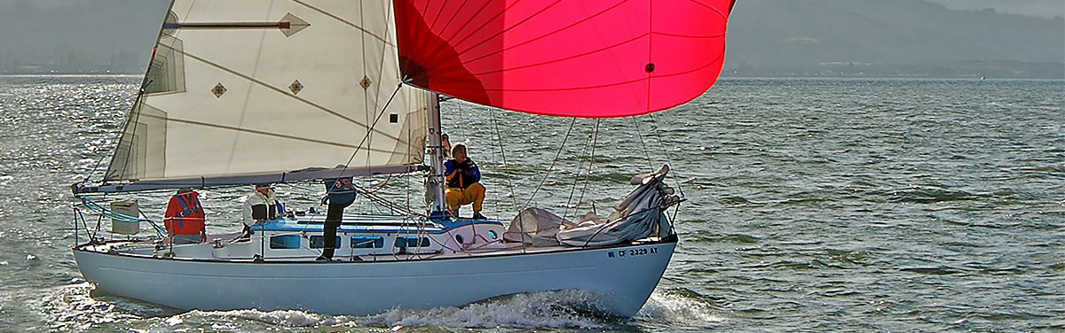
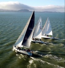
New Article: How I Won Beer Can Races With the Slowest Boat
I had the slowest boat, but still crossed the line ahead of all but the fastest boats. The slowest boat can be first to finish if it sails the shortest distance.
A quick tour of L-36.com
L-36.com is built for sailors but has information that goes well beyond that. About 95% of visitors come here for the Weather Page, but that is only a small part of what is on the site. Below is a quick overview followed by a grid of my favorite pages.
Weather
One page, everything you need. Set your location once and it remembers. You get forecasts and live observations, tides, charts, and maps on a single screen. The goal is simple: fast checks, clear answers, and a bookmark you can tap any time.
More Weather and Tide
Additional weather and tide tools, including day-sail planning and tide charts for the day or week.
Manuals
There are almost 1,000 manuals here, free to use. Some came from the web, many were scanned and shared by readers. They are organized so you can find what you need without hunting. If you have a manual that is missing and are willing to share, please send it along.
Soft shackles and ropework
Most of the soft shackle designs in wide use today started on these pages. These articles cover many designs for many uses. There are detailed step-by-step guides and matching photos so you can build with confidence. A few have videos.
Solo mast climbing
I never felt safe having someone haul me up the mast. The solo mast climbing gear I bought almost dropped me, so I switched to proven mountaineering gear to find a better way. I tested several methods, improved them, and ended up with what I call the ultimate mast climbing method. All the methods are 100% redundant, and the rumors that I fell to my death are not true.
Used sail search
This tool used to include a wide set of vendors. There are fewer now, but it still finds good matches and the occasional gem. It is worth a quick search when you are outfitting on a budget or hunting for a specialty cut. Enter your boat type and the site will search for sails that fit.
Odds and ends - handy references and how-tos
There are lots of small pages that do one thing well. Quick reference tables, calculators, and short how-to notes that came out of real boat work. I invite you to browse the Articles page where you can search by keyword, and the variety of reference material under the hamburger to the right of the menu bar.
Videos
My YouTube channel L-36.com covers a variety of topics and short videos on many of my races. The most popular are on knot tying. Check out the YouTube link under the hamburger.
Getting help fast
If you have a question, send me a note. Use the contact form in the hamburger.
Support the site
Share L-36.com with friends. Send corrections when you see them. If a sponsor link truly helps you, feel free to use it. That is enough.


NOTICE: Some pages have affiliate links to Amazon. As an Amazon Associate, I earn from qualifying purchases. Please read website Cookie, Privacy, and Disclamers by clicking HERE. To contact me click HERE. For my YouTube page click HERE